How Many Slides for a Presentation? The 2025 Guide


There’s nothing quite like a long, text-heavy presentation with zero graphic appeal to make an audience’s eyes glaze over. The question of the ideal number of slides is a puzzle that professionals face daily when preparing their PowerPoint. While there’s no single magic number, the answer lies in a careful balance between your presentation’s length, the complexity of your message, and the visual impact you want to create. Studies show that a presenter’s confidence can increase by over 90% with a well-designed deck, proving that quality trumps quantity every time. In 2025, this trend is more pronounced than ever: the era of overloaded slides is over. Audiences now expect clean, visual, and interactive presentations that get straight to the point. Forget rigid rules and instead learn to structure your thoughts to captivate, persuade, and leave a lasting impression, whether you have five minutes or a full hour. This guide will give you the keys to mastering the art of concision and impact.
The Golden Rules Before You Count Your Slides
Before you even think about slide count, it’s crucial to master a few fundamental principles of structure. A successful presentation isn’t just a series of facts; it’s a story that guides your audience from point A to point B. These universal rules are far more important than the final slide tally.
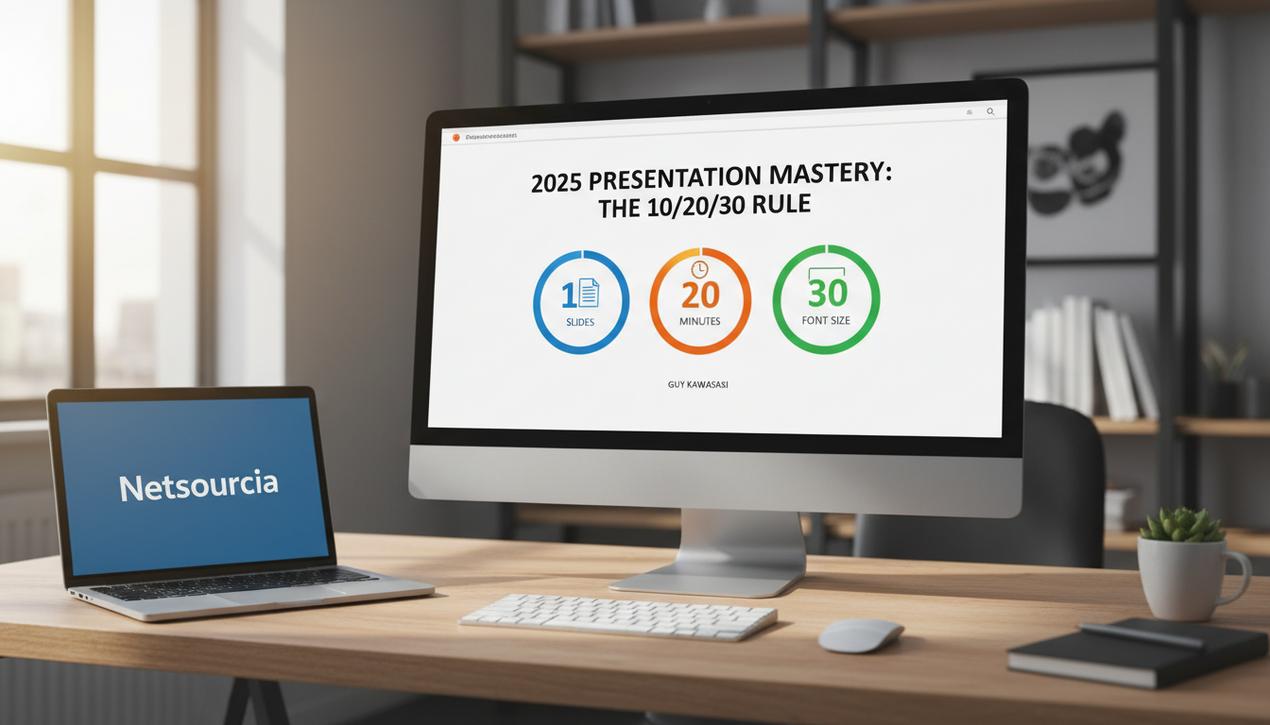
Guy Kawasaki’s 10/20/30 Rule
Popularized by Guy Kawasaki, a former Apple evangelist, this rule is a benchmark for high-stakes pitches and presentations. It advocates for a simple yet incredibly effective structure:
- 10 Slides: The maximum number to present a concept concisely. This forces you to focus on the essential points and eliminate anything superfluous.
- 20 Minutes: The ideal length for the presentation itself. Even if you’re allotted an hour, presenting in 20 minutes leaves ample time for questions and discussion, which is often the most valuable part.
- 30-Point Font: The minimum font size to ensure your text is readable for everyone, even those at the back of the room. This also cleverly prevents you from putting too much text on a single slide.
The Core Principle: One Idea Per Slide
This is the most important rule—and the one most often broken. Every single slide should have one, and only one, main message. If you find yourself using the word “and” to describe what’s on your slide, it probably contains too many ideas. Split them up. This approach enforces clarity, makes your message easier for the audience to remember, and creates a much more dynamic and easy-to-follow presentation.
The Narrative Arc: Structure Your Presentation Like a Story
Humans are wired to listen to stories. Use this to your advantage by structuring your presentation with a simple narrative arc:
- The Introduction (The “Why”): Set the stage and present the problem you’re addressing. This is where you must grab the audience’s attention.
- The Development (The “How”): Propose your solution. This is the heart of your presentation. Explain how it works, provide evidence, data, and examples.
- The Call to Action (The “What’s Next?”): Conclude by clearly stating what you expect from your audience. Whether it’s approving a budget, launching a project, or adopting a new strategy, your final goal must be crystal clear.
How Many Slides for How Long? A Time-Based Guide
Once you’ve integrated these basic principles, you can adapt your slide count to the duration of your talk. The following recommendations are starting points to be adjusted based on the density of your content.
For a 5-Minute Presentation
Slide Count: 5 to 10 slides maximum.
Ideal Context: Startup pitch, flash presentation in a meeting, quick progress update.
For such a short format, concision is king. Your goal is to make a memorable impact quickly. Speaking time is roughly 30 to 60 seconds per slide. Rely on powerful visuals and minimal text in a large font, especially if presenting on a small screen. Each slide must convey a single, powerful idea. Don’t plan a dedicated slide for questions—you won’t have time. Instead, put your contact information on the final slide to allow for follow-up.
For a 10-Minute Presentation
Slide Count: 10 to 20 slides.
Ideal Context: Project proposal, detailed progress report, or a talk to create buzz for a product launch.
With 10 minutes, you have a bit more flexibility. The speaking time per slide can vary: some highly visual slides might fly by in 15 seconds, while a slide with a key chart might require a full minute of explanation. This is the perfect length to apply Kawasaki’s 10/20/30 rule. To maintain clarity:
- Use a balanced mix of short text and relevant images.
- Incorporate plenty of white space to keep slides from feeling cluttered.
- Maintain graphic consistency (fonts, colors) from start to finish.
For a 20 to 30-Minute Presentation
Slide Count: Approximately 20 to 25 slides.
Ideal Context: Quarterly report, training session, detailed sales presentation.
The trap here is to simply add more slides. Paradoxically, it’s often more effective to keep the slide count manageable and spend more time on each one. You can dedicate 3-5 minutes to your introductory slide to properly set the context, and do the same for the conclusion, which can include a Q&A session. For dense sections, don’t hesitate to spend 2-3 minutes on a complex slide. To maintain momentum, insert simple transition slides (e.g., just a section title) to signal new parts and help your audience follow your logic.
For a 45 to 60-Minute Presentation
Slide Count: 25 to 40 slides.
Ideal Context: Conference keynote, seminar, thesis defense, in-depth training.
For such a long format, the main challenge is maintaining audience attention. It’s crucial to vary your media: images, charts, short videos created with some of the top AI video generators, and even interactive elements. Avoid spending more than 5 minutes on a single slide to prevent boredom. An average pace of 1 to 2 minutes per slide is a good baseline. Consider the room’s constraints: on a large screen, elements must be sized appropriately. Place critical information in the upper half of your slides, as the bottom of the screen is often obscured for people in the back. Interactivity becomes a major asset here: ask questions or use live polls to re-engage your audience.
2025 Design Trends for an Impactful PowerPoint
A great message can be ruined by poor design. In 2025, effective presentations adopt clear visual codes that enhance comprehension and retention.
Minimalism and White Space
Less is more. Clean designs with plenty of white space (or negative space) help highlight important information. They convey professionalism and clarity, helping the audience focus on the essentials without visual clutter.
Creative Data Visualization
Ditch the default Excel charts. Use infographics, icons, and creative layouts to present your numbers. Good data design doesn’t just show figures; it tells a story and makes complex information digestible and memorable.
Subtle and Professional Animations
Animations aren’t just for decoration; they should serve your narrative. Use simple animations like fade-ins or slight movements to guide the audience’s eye and reveal information point by point. This prevents the audience from reading the entire slide before you’ve even started speaking.
Bold Typography and High-Contrast Colors
Use modern, legible fonts with varying sizes to create a clear visual hierarchy. The rules for choosing the perfect logo color apply here as well, as high-contrast schemes improve readability and give your presentation a contemporary, dynamic look.
Mistakes to Avoid at All Costs
Certain classic blunders can undermine all your hard work. Here they are, so you can steer clear.
- Overloading slides with text: Your PowerPoint is a visual aid, not a document to be read. Your slides should never be your teleprompter.
- Reading your slides word-for-word: This is the fastest way to put your audience to sleep. They will always read faster than you can speak. Your slides should illustrate your points, not duplicate them.
- Using low-quality images: Pixelated images or dated clip art will instantly discredit your presentation. Invest in high-quality, professional visuals.
- Lacking visual consistency: A jumble of different fonts, colors, and styles creates a sense of disorganization and unprofessionalism. Create a consistent template and stick to it.
- Neglecting the tech check: Always test your equipment before presenting. Connectivity issues, software version conflicts, or missing fonts can cause unnecessary stress and waste precious time.
Ultimately, the quest for the perfect number of slides is the wrong debate. The real question is how to deliver your message as clearly, engagingly, and memorably as possible in the time you have. By focusing on a strong narrative structure, applying the “one idea per slide” principle, and embracing modern design codes, you will transform your presentations from a mere formality into a powerful tool of communication and persuasion.


