The 2025 Guide to Web Safe Fonts for Your Website
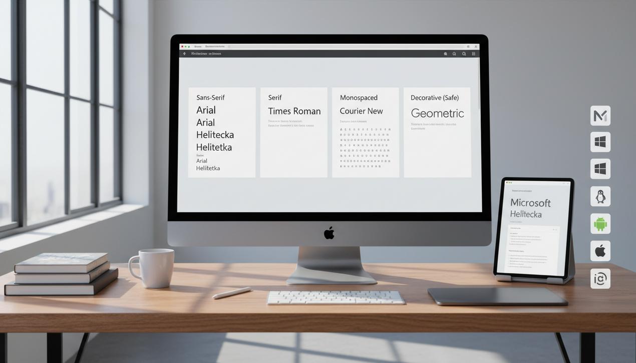
Typography is the silent cornerstone of any successful web design. It accounts for over 70% of a page’s aesthetic and directly influences how users perceive and interact with your content. At the heart of this discipline lies a fundamental concept: “web safe” fonts. These typefaces, pre-installed on the vast majority of operating systems (including Windows, macOS, Linux, Android, and iOS), guarantee a consistent visual experience for all visitors, regardless of their device. In 2025, as page load speed and user experience (UX) have become critical SEO ranking factors, choosing a web safe font remains an incredibly relevant strategy. By eliminating the extra loading time required for custom fonts, they ensure optimal performance while removing the risk of incorrect display. This comprehensive guide will not only provide an exhaustive list of the 25 most reliable web safe fonts but will also explore the criteria for choosing them wisely and the modern alternatives available to you.
What Are Web Safe Fonts and Why Do They Still Matter?
A font is considered “web safe” (or a system font) when it has a very high probability of already being installed on a visitor’s computer or mobile device. This characteristic provides undeniable technical and strategic advantages, even in the age of vast online font libraries like Google Fonts.
The Guarantee of Universal Compatibility
The primary benefit is reliability. When you specify a web safe font in your CSS, you can be almost 99% certain that it will render as intended for your entire audience. This prevents the jarring FOUT (Flash of Unstyled Text) effect, where text briefly appears in a default font before the custom font finishes loading, creating a disruptive visual shift for the user.
A Direct Impact on Web Performance
Performance is the name of the game online. Every additional HTTP request, such as downloading a font file from an external server, adds precious milliseconds to your page’s load time. Because they are local, web safe fonts require zero requests. They render instantly. For a site aiming for perfect scores on tools like PageSpeed Insights, using system fonts is a simple and effective optimization that helps improve Google’s Core Web Vitals metrics.
A Consistent and Predictable User Experience
By ensuring the typography is the same for everyone, you maintain complete control over your design. The spacing, line height, and overall readability of your content remain constant, ensuring a professional and cohesive user experience. This consistency strengthens your brand’s credibility and recognition.
The Ultimate Guide to 25 Essential Web Safe Fonts
To make your choice easier, we have classified the most popular and dependable web safe fonts into four distinct categories: classic sans-serifs, timeless serifs, technical monospaced fonts, and high-impact display fonts.
Classic Sans-Serifs: Modernity and Readability
Sans-serif fonts (without “feet” or serifs) are synonymous with modernity, clarity, and excellent on-screen readability. They are perfect for body text and user interfaces.
- Arial: The most famous and widespread. Its simplicity makes it a safe choice for maximum readability.
- Helvetica: A favorite among designers for its clean lines and perfect balance. It lends a professional and timeless touch.
- Verdana: Designed specifically for legibility on low-resolution screens, its wide characters and generous spacing make it ideal for text paragraphs.
- Trebuchet MS: A warm, humanist font that works well for both headings and body text, offering an elegant alternative to Arial.
- Calibri: The default font for Microsoft Office since 2007, it is extremely familiar to users and highly readable at small sizes.
- Gill Sans: With British origins, it has a classic, clean design that conveys a sense of authority and professionalism.
- Century Gothic: Its geometric and airy design makes it perfect for headings and subheadings that need a modern, clean look.
- Tahoma: Narrower than Verdana, it works well in interfaces where space is limited while maintaining excellent clarity.
Timeless Serifs: Elegance and Tradition
Serif fonts (with “feet”) evoke tradition, sophistication, and the world of publishing. They are ideal for long-form articles, blogs, and sites with premium positioning.
- Times New Roman: The archetypal serif font, associated with journalism and academia. It conveys a formal, serious tone.
- Georgia: Designed for the screen, its serifs are sturdy and clear even at small sizes, making it an excellent choice for body text.
- Garamond: A classic, elegant font with an old-world feel, perfect for sites that want to communicate a sense of heritage and quality.
- Baskerville: A transitional typeface that blends elegance with readability. It is perfect for luxury brands or literary blogs.
- Palatino: A Renaissance style that brings a touch of class and formality, often used for headlines.
- Bookman Old Style: Sturdy and legible, it is excellent for headlines that need to be both strong and elegant.
- Cambria: A modern serif font designed by Microsoft for optimal on-screen reading, making it very versatile.
Monospaced Fonts: Precision and Technical Style
In a monospaced font, every character occupies the same amount of horizontal space. They are often associated with code, technology, and typewriters.
- Courier New: The classic typewriter look, perfect for displaying code snippets or creating a retro style.
- Lucida Console: A more modern and highly readable alternative to Courier New, designed for programming interfaces.
- Consolas: Optimized for Microsoft’s ClearType technology, it is extremely clear for displaying code.
- Monaco: The default monospaced font on macOS before Menlo, and a long-time favorite of developers.
Display and Decorative Fonts: For Visual Impact
Use these sparingly for headings, logos, or calls-to-action, as they sometimes sacrifice readability for style.
- Impact: A very bold and condensed sans-serif designed to have maximum impact in headlines.
- Copperplate Gothic: Wide and stately, it evokes a sense of engraving and is suitable for titles that need to convey permanence and prestige.
- Papyrus: Often criticized for its overuse, it remains a web safe font that, in rare contexts, can add a rustic or ancient touch.
- Luminari: A decorative font with a medieval feel, best reserved for short, thematic titles.
- Bradley Hand: A handwritten font that provides a personal and informal touch, ideal for a personal blog or pull quotes.
How to Choose the Right Web Safe Font for Your Project
Selecting a font is not a random act. It’s a strategic design decision that should align with your goals and brand identity.
1. Define Your Brand’s Identity and Tone
Your typography should be an extension of your message. A serif font like Baskerville will evoke luxury and tradition, while a sans-serif like Calibri will be perceived as modern and approachable. Ask yourself: is your brand serious, playful, innovative, or classic? The answer will guide your initial selection.
2. Prioritize Readability Above All
A beautiful design is useless if your text is illegible. Ensure the font you choose for your body text is comfortable to read in long paragraphs. Pay close attention to line height, font size, and color contrast. Good readability can improve time on page and reduce your bounce rate.
3. Create a Clear Visual Hierarchy
Use a combination of fonts (or different weights of the same font) to structure your content. A powerful font for headings (H1, H2) and a highly readable font for paragraphs help users scan the page and quickly identify important information.
Beyond Web Safe: Google Fonts and Variable Fonts
In 2025, web safe fonts are no longer the only option. Technology has evolved, offering greater creative flexibility. Google Fonts is now the most popular compromise. With a library of over 1,500 fonts, they are easy to integrate and offer a vast selection. However, they introduce a dependency on a third-party service and add a slight load time. The most recent trend is the emergence of variable fonts. A single font file can contain a multitude of styles (weights, widths, etc.), offering immense design flexibility for an optimized file size. It’s a promising technology that combines customization and performance.
In conclusion, web safe fonts remain a solid and high-performing foundation for any web design strategy. They offer a guarantee of speed, compatibility, and consistency that alternatives still struggle to match without compromise. Whether you use them as your primary choice for maximum performance or as a reliable fallback in your CSS font stack, mastering them is essential. The final decision will always depend on a careful balance between your brand identity, readability requirements, and your site’s performance goals. By making an informed choice, you ensure your message is not only seen but also read and appreciated by your audience.

Ever wonder what theme a beautiful website uses? This guide shows you how to find any WordPress theme in minutes, Lire la suite

Learn how to create a forum with our 2025 guide. We compare the 7 best tools like Discourse and bbPress Lire la suite

Learn how to create an online course website to successfully monetize your skills. This complete guide walks you through 7 Lire la suite

Creating a website mockup is the crucial first step before development. Our guide details the process, from wireframe to interactive Lire la suite