How to Choose the Perfect Logo Color in 2025

A logo’s color is far more than an aesthetic choice; it’s the silent ambassador for your brand. In the blink of an eye, it conveys values, triggers emotions, and profoundly influences consumer perception. Research shows that color can increase brand recognition by up to 80%, a critical advantage in a saturated marketplace where every detail matters. Furthermore, up to 90% of snap judgments made about products can be based on color alone. In 2025, with visual identity at the heart of every successful branding strategy and one of the essential marketing skills to master, understanding color psychology is no longer an option—it’s a strategic necessity. Choosing the right color palette can not only set your business apart from the competition but also build a lasting bond of trust with your target audience. This comprehensive guide will help you navigate the intricate world of color psychology to make an informed decision that aligns with your brand’s personality and your customers’ expectations.
The Deep Psychology of Color in Branding
Before diving into the specific meanings of each hue, it’s crucial to understand the psychological mechanisms they activate. Color is a form of non-verbal communication that speaks directly to our subconscious. Each shade has a unique wavelength that our brain interprets, triggering a cascade of cultural, personal, and universal associations. For any brand, mastering this visual language is a significant competitive advantage.
First Impressions are Chromatic
When a consumer first sees your logo, their brain processes the color even before they read the company name or analyze the shape. This near-instantaneous reaction forms a powerful first impression. A vibrant, energetic color like red or orange can communicate boldness and speed, while a sober, deep blue will inspire feelings of trust and stability. This initial visual contact sets the tone for the entire customer relationship.
Building Your Brand’s Personality
Colors are essential tools for building and reinforcing your brand’s personality. Do you want to be perceived as innovative and daring, or as reliable and traditional? Your color choice must be a direct reflection of the values and character traits you want to embody. A consistent color palette, deployed across all communication channels, solidifies this personality in the minds of consumers, creating a coherent and memorable brand experience.
A Detailed Guide to Logo Color Meanings
Each color carries a spectrum of meanings. The right choice will depend on the emotion you wish to evoke and the message you want to send. Here is an in-depth analysis of the most common hues and their applications in branding.
Warm Colors: Energy, Passion, and Optimism
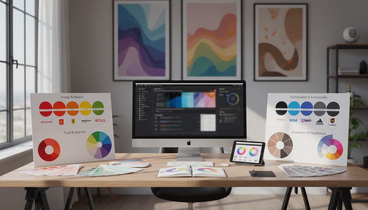
- Red: The color of energy, passion, urgency, and excitement. Red is a powerful hue that immediately grabs attention. It’s often used in the food and restaurant industry (Coca-Cola, McDonald’s, KFC), automotive sector (Ferrari, Toyota), and entertainment (Netflix, YouTube) to stimulate appetite or create a sense of urgency.
- Orange: Less aggressive than red, orange combines vitality with friendliness. It’s perceived as cheerful, confident, and enthusiastic. It’s an excellent choice for brands that want to appear accessible and creative, such as Fanta, Amazon, or SoundCloud.
- Yellow: Communicating optimism, warmth, and clarity. Yellow is associated with happiness and motivation. It is highly visible and great for grabbing attention in displays. It’s often used by service-based companies or energy brands (IKEA, Shell, Nikon).
Cool Colors: Trust, Serenity, and Growth
- Blue: The most popular color in corporate branding for a reason. Blue inspires trust, security, professionalism, and calm. It is ubiquitous in the technology (Meta, IBM, Dell), finance (PayPal, Visa), and healthcare industries, where reliability is paramount.
- Green: Strongly linked to nature, growth, health, and tranquility. Green is the obvious choice for eco-friendly, organic, or wellness brands (Whole Foods Market, Starbucks). Darker shades of green can also evoke wealth and prestige, making them relevant for the financial sector.
- Purple: Traditionally associated with royalty, luxury, wisdom, and creativity. Purple suggests sophistication and mystery. It is often used by high-end, imaginative brands or in the beauty and wellness industries (Cadbury, Twitch, Hallmark).
Neutral and Unique Colors
- Black: Represents power, elegance, luxury, and sophistication. Black is a timeless and versatile choice, popular with fashion, technology, and luxury brands (Chanel, Adidas, Apple). It provides strong contrast and legibility.
- White & Gray: White symbolizes simplicity, purity, and minimalism. It is often used as negative space to create a clean and modern feel. Gray is associated with seriousness, maturity, and balance. As a neutral color, it works well as a secondary hue to support a primary color.
- Pink: While often associated with femininity, pink’s meaning has broadened. Bright pinks are youthful and playful (Barbie, T-Mobile), while muted or dusty pinks can suggest modern luxury and sensitivity.
- Brown: Evokes earthiness, ruggedness, reliability, and authenticity. Brown is often used for brands that want to project a natural, artisanal, or masculine image (UPS, Nespresso).
- Multicolor: A multicolor logo communicates diversity, creativity, and openness. It’s the choice of tech giants like Google and Microsoft to represent their wide array of services and of brands like eBay to symbolize variety.
Key Logo Color Trends to Watch in 2025
The design world is constantly evolving. In 2025, several strong trends are shaping how brands use color to stay modern and relevant.
- Vibrant Gradients: Gradients have made a major comeback, adding depth and a sense of dynamic energy to logos. They are perfect for tech companies and creative brands looking to convey innovation and fluidity, often animated with the best motion design software.
- Earthy and Muted Palettes: In response to digital saturation, many brands are adopting calmer, organic tones like terracotta, olive green, and beige. These colors evoke authenticity, sustainability, and wellness—values that resonate strongly with modern consumers.
- High-Contrast Minimalism: This trend pairs a simple, often monochrome palette with a single, bold accent color. The result is a strong visual impact that remains clean, confident, and modern.
A 4-Step Guide to Choosing Your Color Palette
Selecting a logo color should be a strategic process. Here is a four-step method to guide you to the perfect choice.
1. Define Your Brand’s Personality and Values
Before you even look at a color wheel, list the adjectives that best describe your business. Is it youthful and energetic, or serious and dependable? Luxurious and exclusive, or affordable and friendly? These personality traits will naturally point you toward an appropriate family of colors.
2. Analyze Your Competition and Industry
Research the logos of your main competitors. The goal isn’t to copy them but to understand the existing color landscape in your industry. This allows you to make a strategic choice: either align with established industry norms (like using blue in finance to build trust) or disrupt them with a completely different color to stand out.
3. Consider Cultural Meanings
If your brand operates internationally, understanding the cultural context of colors is vital. For example, in Western cultures, white symbolizes purity and weddings, but in many Eastern cultures, it is the color of mourning. Red signifies luck and prosperity in China, while it can represent danger in other parts of the world. Thorough research can help you avoid cultural missteps.
4. Test Your Color Choices Extensively
Once you have a shortlist, test your colors in various contexts. Will your logo be legible in black and white? How does it look on both a light and a dark background? Does it work in a small format, like a favicon or app icon, as well as on a large billboard? Consider running A/B tests with your target audience to gather feedback and ensure the emotional response matches your brand’s intent.
Choosing your logo’s color is one of the most impactful branding decisions you will make. It’s a strategic investment that will shape the public perception of your company for years to come. By combining an understanding of psychology, an awareness of current trends, and a methodical selection process, you can create a color palette that is not only visually appealing but also tells your brand’s story and connects deeply with your audience.
