A Guide to Flawless Font Combinations for 2025
In the hyper-competitive digital landscape, first impressions are everything. Research consistently shows that users form an opinion about a website in milliseconds, and a staggering 75% of a company’s credibility is judged solely on its website’s aesthetics. At the heart of this design, a frequently underestimated element plays a pivotal role: typography. Far more than a simple stylistic choice, your font combination is the silent ambassador of your brand. It conveys emotion, establishes visual hierarchy, and directly influences how visitors perceive your message. A poor pairing can create confusion and undermine professionalism, while a masterful combination strengthens your identity and captivates your audience. In 2025, typography trends are shifting towards greater personality and expression, making this decision more strategic than ever. So, how do you navigate thousands of typefaces to find the perfect pair? How do you ensure your choices are legible, harmonious, and perfectly aligned with your brand image? This guide demystifies the psychology of fonts and presents 12 essential tools to help you create powerful and effective typographic combinations.
The Psychology of Fonts: How Typefaces Influence Users
Typography is not just a matter of taste; it is a science of perception. Every font has a distinct personality that evokes subconscious feelings and associations in the reader. Understanding this psychology is the first step toward making informed choices that serve your communication and business goals.
Serif vs. Sans Serif: The Core of Perception
The most fundamental choice in typography is between Serif (with small strokes, or “feet,” attached to the letters) and Sans Serif (without them). Their psychological impacts are profoundly different:
- Serif Fonts (e.g., Times New Roman, Garamond, Playfair Display): The small flourishes on serif fonts create a sense of tradition, reliability, elegance, and respectability. They are often the choice for financial institutions, law firms, universities, and luxury brands seeking to inspire trust and authority. They are also widely considered to enhance readability in long blocks of printed text.
- Sans Serif Fonts (e.g., Arial, Helvetica, Roboto, Lato): Their clean, modern appearance evokes simplicity, approachability, and innovation. They are the go-to for tech startups, digital agencies, and brands that want to appear straightforward and contemporary. Their clarity and scalability make them highly effective on digital screens for both headlines and body text.
Weight and Style as Emotional Modifiers
Beyond the font family, variations in weight (light, regular, bold, black) and style (italic) fine-tune the message. A thin, light font can feel elegant and minimalist, while a heavy, bold font communicates strength, importance, and confidence. Italics, on the other hand, are often used to add emphasis, quote a source, or convey a more personal, nuanced, or sophisticated tone.
Key Typography Trends Shaping Web Design in 2025
Web typography is constantly evolving, often in step with the major marketing trends of 2025. While readability remains the ultimate priority, 2025 is marked by bold trends that elevate text from mere content to a central design element.
1. The Rise of Expressive and Maximalist Typography
Pushing back against years of minimalist design, oversized and expressive fonts are taking center stage. Headlines are no longer just text; they are powerful graphic elements that dominate the screen. This “brutalist” or “anti-design” approach uses bold, heavy-weight characters to grab attention instantly and project a strong, unapologetic brand identity.
2. Variable Fonts for Dynamic and Interactive Experiences
As one of the key tech evolutions shaping 2025, variable fonts are a technical game-changer. A single font file can contain a multitude of styles, weights, and widths. This allows designers to create subtle animations, smooth transitions, and perfectly responsive designs that adapt fluidly to any screen size. The result is a richer, more dynamic user experience without increasing page load times.
3. The Human Touch of imperfect and Hand-Drawn Fonts
In an increasingly digital world, fonts that evoke a sense of humanity and craftsmanship are gaining traction. Handwritten script fonts and typefaces with deliberate imperfections add warmth, authenticity, and a personal touch. They are ideal for brands in the creative, wellness, or artisanal sectors looking to build a more intimate connection with their audience.
The Golden Rules for Successful Font Pairing
Pairing fonts is an art guided by a few fundamental principles. By following these rules, you can create harmonious and effective combinations, even if you’re not a professional designer.
1. Establish Clear and Intentional Contrast
The secret to a great font pairing is contrast. Combining two fonts that are too similar creates a jarring visual conflict. The goal is to find typefaces that are distinctly different yet complementary. The most effective pairings often involve:
- Serif and Sans Serif: The classic, timeless contrast. Use a bold serif for headlines and a clean sans serif for body text, or vice versa.
- Weight Contrast: Use different weights from the same font family (e.g., a headline in Montserrat Black with body text in Montserrat Regular). This creates hierarchy while ensuring a cohesive look.
- Style Contrast: Pair a highly stylized display or script font for headlines with a neutral, highly readable font for the main text.
2. Limit Your Number of Fonts
A cardinal rule of typography is to never use more than three different fonts on a single website. Ideally, stick to two: one for headings (H1, H2, H3) and one for the body text. Using too many fonts creates visual chaos, dilutes your brand identity, and looks unprofessional.
3. Build a Strong Visual Hierarchy
Your typography should guide the reader’s eye through the content. Use size, weight, and style to clearly differentiate levels of information. Your main headline (H1) should be the most prominent element, followed by subheadings (H2, H3), and then the body text. This hierarchy improves the scannability of your page and makes your content easier to digest.
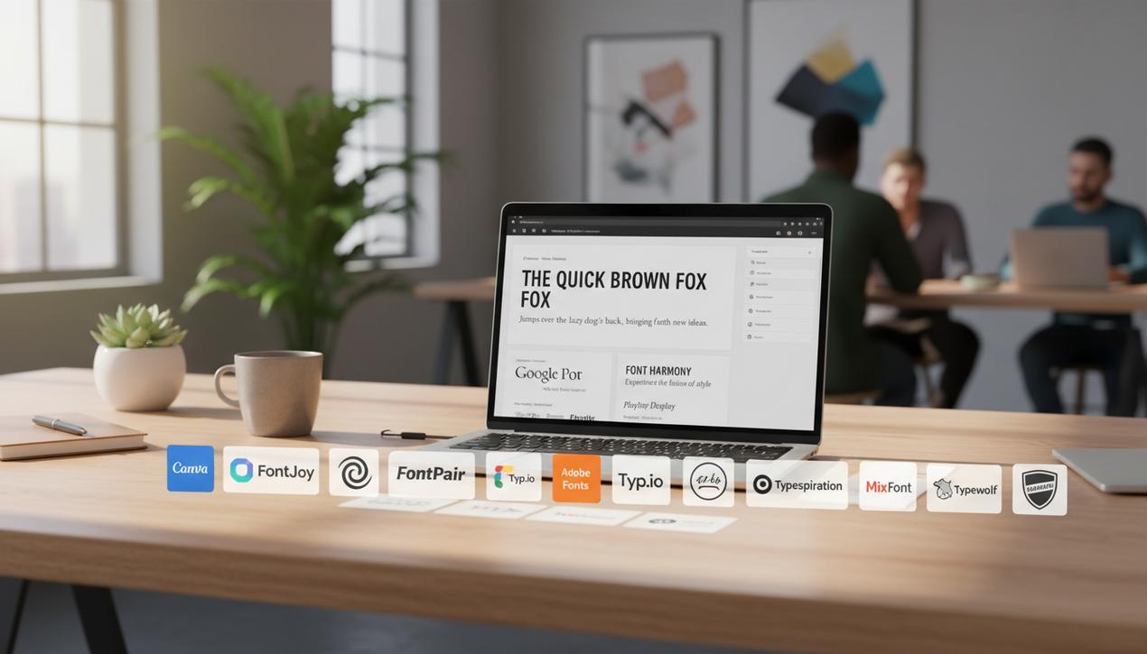
12 Essential Tools for Finding the Ideal Font Combination
Fortunately, you don’t have to go it alone. Numerous tools exist to help you explore, test, and validate your typographic choices, often best visualized with the best mockup generators. Here is a curated selection of 12 free and powerful resources.
1. Canva Font Combinations
The popular graphic design tool offers a simple and effective combination generator. Just choose a starting font, and Canva instantly suggests a harmonious partner with a live preview.
2. FontJoy
FontJoy uses artificial intelligence to generate font pairings. You can adjust the desired level of contrast and “lock in” fonts you like while generating new options for the others. Its intuitive interface makes it an excellent tool for inspiration.
3. FontPair
Specializing in Google Fonts, FontPair allows you to filter combinations by typeface category (e.g., Serif/Sans-Serif, Display/Serif). It’s a quick, visual way to find proven pairings that work well together.
4. Google Fonts
Right on the Google Fonts platform itself, when you select a font, a “Pairings” tab shows you a list of the most popular and successful combinations with that specific typeface. It’s simple, integrated, and highly effective.
5. Adobe Fonts
Adobe offers curated “Font Packs,” which are collections of fonts organized by theme (e.g., “Vintage,” “Futuristic”) and assembled by typography experts. This is a great resource for finding a cohesive set of fonts for an entire project.
6. Typ.io
This tool takes a real-world approach. Typ.io analyzes thousands of live websites and shows you which font combinations they are using. It’s perfect for getting inspiration from existing designs and seeing how fonts perform in context.
7. Typespiration
Similar to Typ.io, Typespiration showcases website designs, highlighting not only the fonts but also the color palettes. It even provides the CSS code to help you get started quickly.
8. Fonts in Use
A massive, collaborative archive that documents typography in real-world projects, from websites and magazines to posters and packaging. It’s an invaluable resource for deep research and inspiration.
9. Typewolf
Regarded as a gold standard by many designers, Typewolf provides daily showcases of websites with exceptional typography. It also offers comprehensive guides, checklists, and recommendations for the best fonts available today.
10. Archetype
This beautiful and intuitive tool allows you to select a headline and body font and instantly preview them in a well-designed layout. You can adjust sizes, spacing, and colors in real-time, making it perfect for fine-tuning your choices.
11. Reliable
A modern tool focused on showcasing combinations of variable fonts from Google Fonts. It lets you visualize and experiment with the different weights and styles contained within a single font file, making it perfect for exploring the latest trends.
12. WhatFont Tool
While not a generator, this browser extension is an indispensable tool for designers. See a font you like on a website? Simply click on it with the WhatFont extension to instantly identify the font, its size, weight, and color.
Choosing your fonts is a decision that shapes the identity and credibility of your online presence. By understanding the core principles of typographic psychology and leveraging the right tools, you can transform your text from simple information into a powerful visual experience. Take the time to experiment and find the combination that not only beautifies your site but also tells your brand’s story in the most authentic and impactful way possible.

Master the SWOT analysis with our comprehensive guide. Learn to define your strengths, weaknesses, opportunities, and threats to build a Lire la suite
Optimize your workflow with our selection of the best CSS generators. Create complex animations, grids, and gradients in just a Lire la suite

Master your digital strategy with the best website traffic analysis tools. Our 2025 guide compares 9 essential platforms to understand Lire la suite

Find the best note-taking apps for 2025. Our guide reviews 12 top options, from powerhouses like Notion to minimalist tools, Lire la suite